
bbr marketing Blog
Related Articles
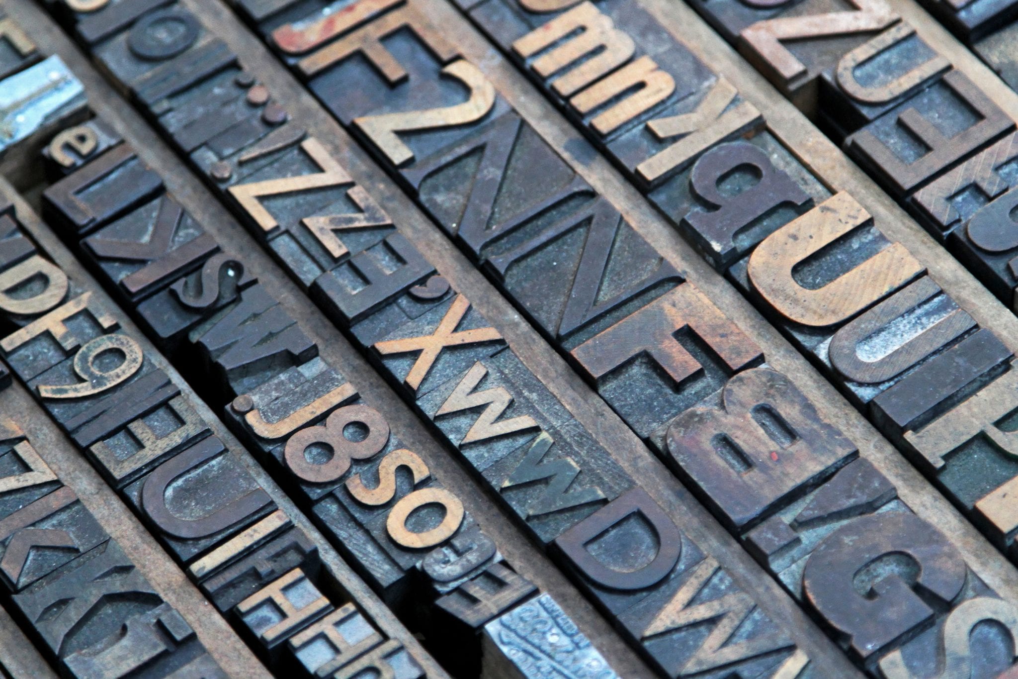
Fonts Make a Difference
By bbr
by Sarah Warlick, content director
Research proves what designers have long known: the choice of font impacts the perception and subsequent behavior of readers.
 Design makes a difference. Whether it’s about the layout of the material, the colors used or the font, design choices have a major influence on the way readers feel about the content they see, the way they engage with it and how they recall the information. That’s a basic principle that most people have heard over and over but it’s often assumed to be only a theory, if an obvious one.
It’s for real, says the research. Carefully crafted studies support the premise that the fonts readers see have an impact on their interpretation of the content and on the behavior that follows. Design choices are indeed a powerful thing!
A study conducted by researchers at Leeds Beckett University and Manchester University provides solid research that shows font choices affect not only readers’ perception about the content but their subsequent behavior.
In the study, pregnant women received treatment instructions in one of four different font combinations. The protocol was the same for all patients; only the fonts varied. Study participants then rated the instructions they got in terms of complexity, risk, effort and appearance. The results were of interest not just to doctors, but to marketers as well. According to the researchers:
• “The easier the font was to read, the less complex the intervention was perceived” and
• “The font of written information may also determine adherence to interventions.”
It’s easy to look at this fact and think, “Of course. I knew that.” But while it does seem obvious and intuitive, it’s often ignored in the fun and frenzy of creating attractive communications intended to stand out. It’s a critical piece of knowledge to keep in mind, though, since it holds significant sway over the intended recipients of the communication.
The same rule holds true whether you’re a doctor giving life-critical medical instructions or a marketer trying to influence conversion rates: To get through to readers and encourage them to read the message, understand the information and respond in the desired manner (e.g. heed a call to action, request an appointment, submit their contact information), content creators must present it in a clear, undemanding visual format that invites effortless exploration and interpretation.
From the reader’s perspective, if it looks complicated it is complicated. If visually decoding the information requires much effort, many simply won’t bother to read it, much less to do it or even figure out what is being offered or requested. Those who do will have the sensation that they’re working hard – measurably more so than with a less demanding font. That’s not a feeling any marketer wants to foist on an audience.
There’s more evidence of the same thing in other studies, too. All of this research is supporting the concept of cognitive fluency, the operative principle at work here. Basically, cognitive fluency means readers take that extra effort they have to expend on decoding the demanding font and mentally apply it to what they read, causing their perception of what they read to be skewed towards complexity.
The upshot is that marketers should always bear in mind that simple, easy-to-read messages are more effective than complex alternatives, no matter how appealing they may be from a creativity standpoint. Use clear, simple words in clear, simple fonts to help your readers feel empowered and interested. Doing so will increase the likelihood that they will absorb your message and comply with your requests.
To read a bit more about cognitive fluency, marketing and fonts, you can read Roger Dooley’s article that on the Neuromarketing website.